We see medians, quartiles, percentiles, and quantiles everywhere we look. For example, we see them sports (“the native of the Dominican Republic ranked in the… 95th percentile in expected slugging percentage and 82nd percentile in hard-hit rate”), finance (“the index currently stands at just the 20th percentile of the historical distribution”), and real estate (“median price still $32,000 higher than last year”). For those who’ve taken a probability course, quantiles must sound familiar. But, what is a quantile, or a percentile? And how do we compute and interpret them?
This came up for me and my colleagues at BetterUp recently. We had run a typical analysis and ended up computing some important quantiles of the data. To ensure our story was clear and crisp, we asked, What exactly happens when we run quantile() in R? What does the output really mean? We all sort of knew, but I wish I’d firmly known the answer.
Let’s take a look at two examples that help show what sorts of questions can arise when computing quantiles.
First, in example A, consider the 0th, 25th, 50th (median), 75th, and 100th quantiles of the numbers 0 through 10:
quantile(c(0,1,2,3,4,5,6,7,8,9,10))
  0%  25%  50%  75% 100%
 0.0  2.5  5.0  7.5 10.0
And now in example B, let’s look at the same quantiles for just three numbers, 0, 1, and 2:
quantile(c(0,1,2))
  0%  25%  50%  75% 100%
 0.0  0.5  1.0  1.5  2.0
Some questions that come to my mind include, how can we have a quantile that’s not in the original data (e.g. 7.5 in example A)? How can 50% of our data in example B be less than 1, when we know that one out of three numbers in the data are less than 1? If the 0th-quantile means 0% of the data is less than 0, how can we have it such that 100% of the data is less than the maximum (but not include the maximum)?
In this article we will explore and learn about what quantiles are (since I seem to have forgotten), and will dissect the quantile() function in R.
What’s a Quantile?
We’ll talk about quantiles here, but there’s a summary below about medians, quartiles, and percentiles. To begin though, I’ve found Gilchrist’s (2000) definition of a quantile the easiest to understand:
A quantile is simply the value that corresponds to a specified proportion of a sample or population.
A couple things stand out to me here. First, I like his use of “proportion” — this feels to me like the easiest-to-understand term to use. Second, notice the use of both sample and population. We know going forward then that we need to consider both.
A quantile is best seen as a function, where we put in a proportion from 0 to 1 (inclusive) and the output denotes the value of the data that has that proportion of data less than it.
As the R documentation for the quantile function puts it:
The generic function
quantileproduces sample quantiles corresponding to the given probabilities. The smallest observation corresponds to a probability of 0 and the largest to a probability of 1.
They refer to the proportions as probabilities, and specifically indicate this function produces sample quantiles. What importance does the sample quantile hold for us? Hyndman and Fan (1996) specifies:
Sample quantiles provide nonparametric estimators of their population counterparts.
Here we have a very critical relationship: the sample quantile estimates the population quantile. Like the standard deviation, or even the mean, we have definitions for the sample estimators in the event we don’t have the population parameters (which is almost always the case). Sample estimators aim to fulfill a number of qualities that make one better than another.
This means it’s an open question how to estimate the population parameters. Over many decades, many researchers have identified multiple ways we can do that. Hyndman and Fan (1996) review nine different ways to estimate the sample quantiles. R implements these and sets a default for the user.
In review, a quantile is the value that corresponds to a specified proportion of the sample data or population. Almost never do we know the population parameters, so we must rely on estimating them with sample estimators. The quantile funciton in R provides nine different quantile sample estimator functions for the user to choose from.
What are the median, quartiles, and percentiles?
We can refer to Gilchrist (2000) for the definition of the median:
Thus the median of a sample of data is the quantile corresponding to a proportion of 0.5 of the ordered data. For a theoretical population it corresponds to the quantile with probability of 0.5.
Quartiles correspond to proportions of the data at 0.25 and 0.75 as well. Percentiles correspond to proprtions of the data every 1-percentage points. So, the 50th-percentile corresponds to the 50th-quantile which corresponds to the 2nd-quartiles which corresponds to the median.
Population Quantiles
In this example, we’ll look at population quantiles for the normal distribution. In this case we know how to parameterize the distribution and we have a continuous equation for the distribution. Both make the following case possible.
Here is the normal (gaussian) distribution, which you might be familiar with:
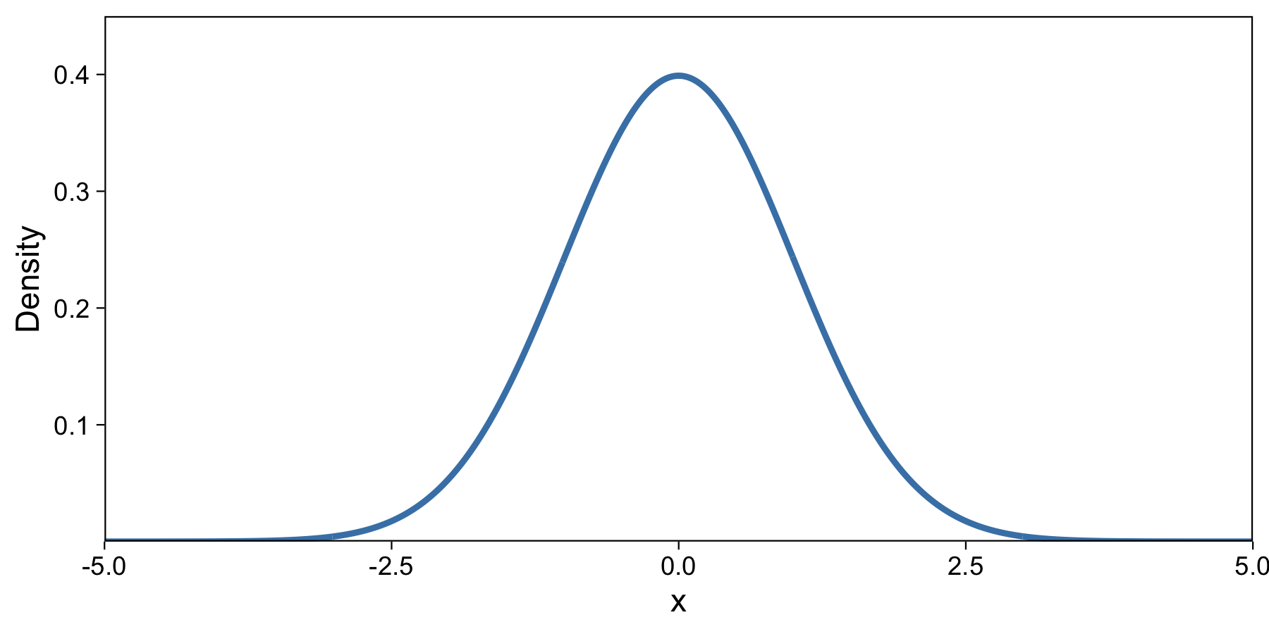
Most of the density of this distribution is between about -3 and 3. If we were to draw a random number from this distribution, it’d probably be close to 0. After many draws, about 95% would be between -1.96 and 1.96. I drew this plot in R with the dnorm function.
If you’ve taken an intro probability course, you might recognize that with the density function (like the one above), we can take the integral and compute the cumulative density function (CDF). We do so here:
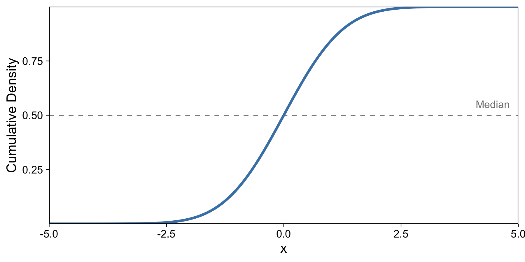
This makes the y-axis our cumulative density, and we know that the cumulative density describes at each value the proportion of data up to that value. So here I’ve labeled the median, which describes 50% of the data up to that point. I drew this plot in R with the pnorm function.
But as you can see, our median isn’t yet an easily computed result of a function. We’d have to take the y-axis value, 0.5, and compute the x-axis value of the blue line at that value. How do we make this easier to compute and interpret?
The answer is the take the inverse of the cumulative distribution, which is known as the Quantile Function.
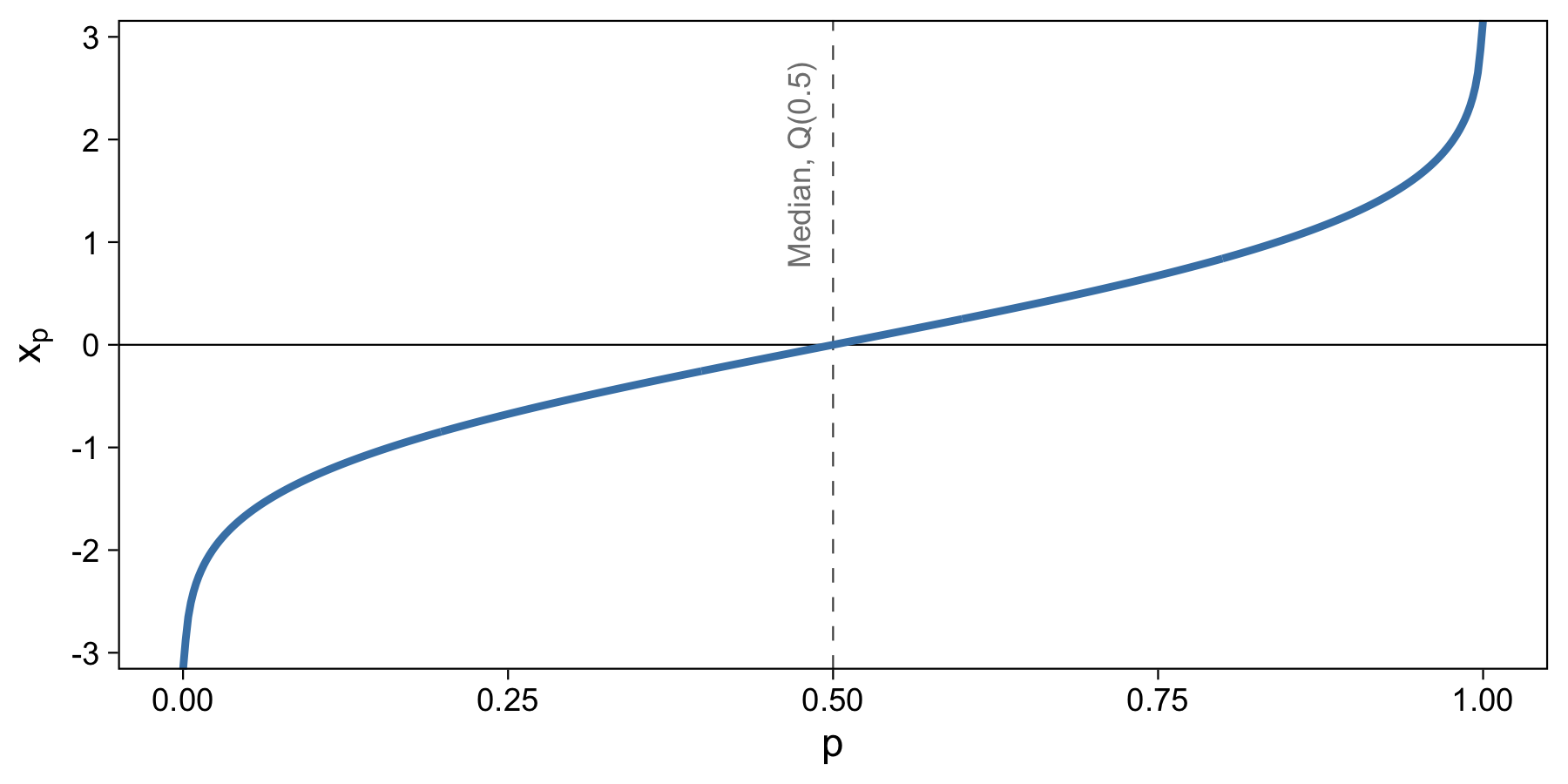
It’s possible to visualize this plot because the equation for the normal distribution has an inverse. Now, it’s easy to take a proportion, say 0.5, and use that equation to quickly and easily output the value of the data that corresponds with it. I drew this plot in R with the qnorm function.
Sample Estimation of Quantiles with Real Data
Let’s play with some real data. Here we’ll take the publication dates of the top 20 most cited scientific papers in history. The years these papers were published are, in chronological order,
1951, 1957, 1958, 1959, 1962, 1970, 1975, 1975, 1976, 1977, 1979, 1987, 1987, 1988, 1990, 1993, 1994, 1996, 1997, 2008
This data was put together in 2014 by Thompson Reuters/Web of Science and written up by a few at Nature. There’s an alternative list put together by Google Scholar.
What are the most cited scientific papers?
According to the list I found, the top three most cited papers are:- 305,148 citations: Lowry, O. H.(1951). Protein measurement with the Folin phenol reagent. J biol Chem, 193, 265-275.
- 213,005 citations: Laemmli, U. K.(1970). Cleavage of structural proteins during the assembly of the head of bacteriophage T4. Nature, 227(5259), 680-685.
- 155,530 citations: Bradford, M. M.(1976). A rapid and sensitive method for the quantitation of microgram quantities of protein utilizing the principle of protein-dye binding. Analytical biochemistry, 72(1-2), 248-254.
This is 1-dimensional data, and here’s a visualization of the dates:
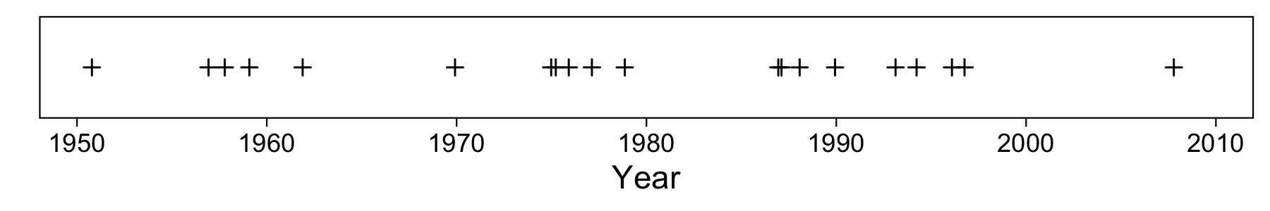
For illustration purposes I’ve added a little random horizontal jitter. You can see that our oldest paper was published in the 50s, and the most recent just before 2010.
Creating a denisty plot is fairly easy; we just create a histogram of the data.
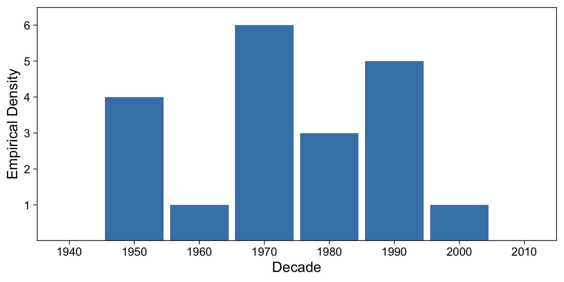
We’ve bucketed in 10-year increments, and we can see that each decade from 1950 to 2010 has at least one paper which made it to the top 20 papers. The decade with the most top papers is the 1970s, with 6 papers.
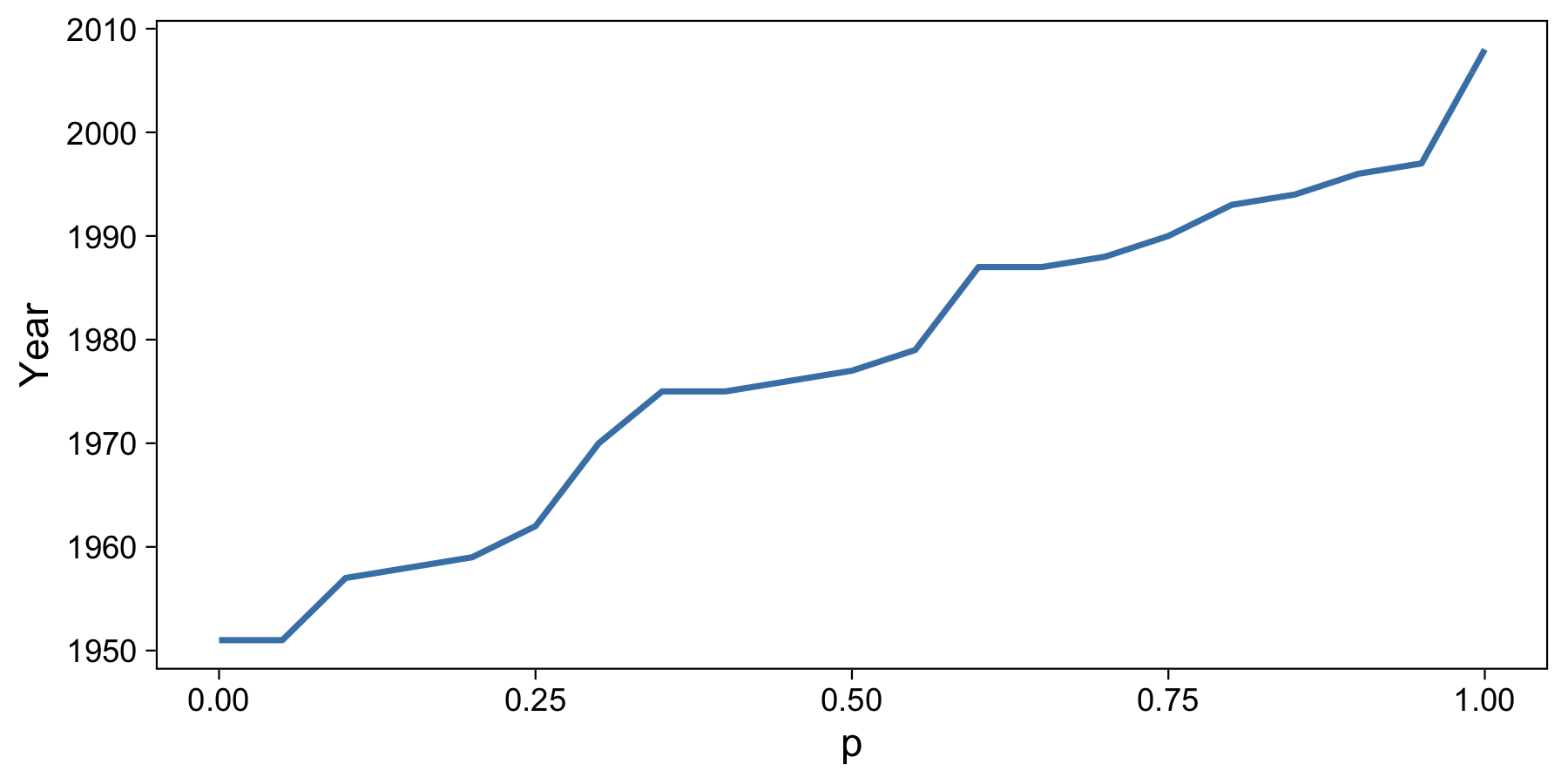
Now knowing how we progressed from density function to cumulative density function in the population example above, we have to do a similar step here. To do this, we sort our data and assign each a number in ascending order, up to 20. We know that 100% of our data lies less than or equal to 20 and above 0, so we can normalize the y-axis to set 20 to 1.0. This also holds with our definition of the Quantile Function above (the probability that data is less than or equal to 20 is 1.0).
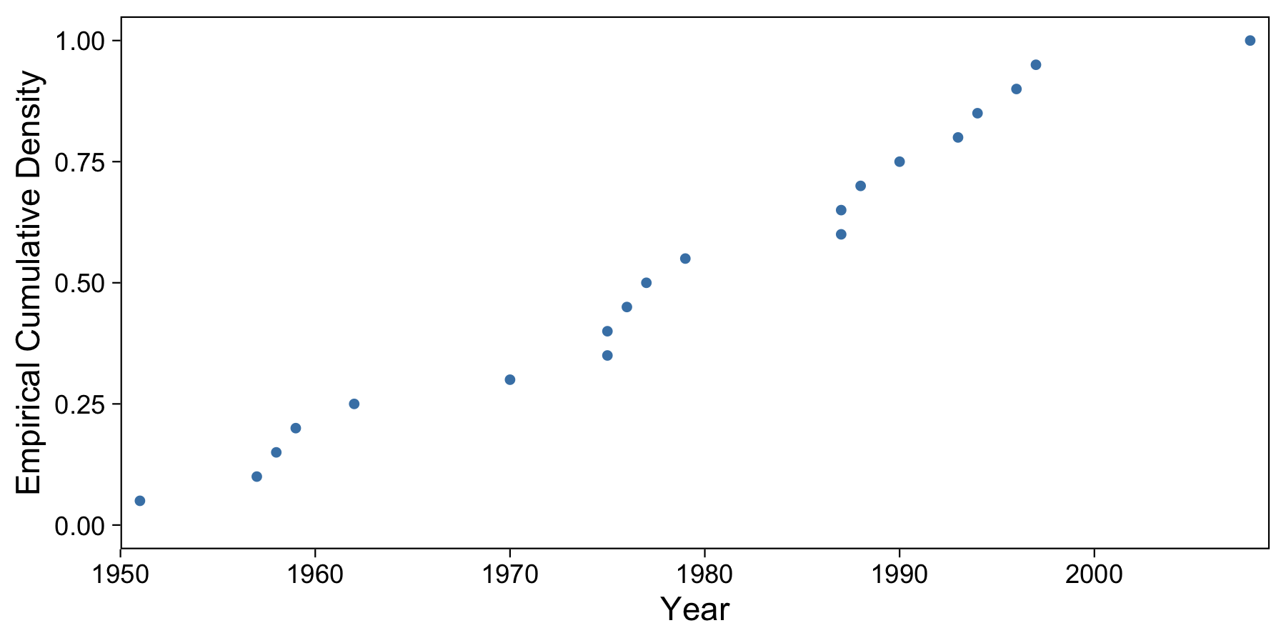
I found it confusing how the smallest data point, 1951, falls at \(p=0.05\). Why not 0? We’re saying that the probability that the data are less than 1951 is one-twentieth or less. Or, equivalently, that 95% or more of the data are 1951 or more recent. As you can tell, it’s very important to have the incusivity of range boundaries defined. We can see this slightly better in the next section.
We can though interpret this graph a little for some interesting results. For example, in this sample, see can see that about 50% of the data lie before 1980. Almost all of the data lie before 2000. All of the data lie after 1950.
The next step is to formalize these conclusions into a formula that we can use to plug in numbers like 0.5, 0.95, or 0.0 to come to similar conclusions.
How we do this is where things get interesting!
Sample Estimation of Quantiles
Unlike our theoretical population example, whose density function is based off a continuous equation, the sample density function is not defined by an invertible function. This is always true when working with a set of raw sample data.
Because the sample density function, and thus CDF, are step functions, we can’t take the inverse. This would lead to some input values resulting in multiple output values, which means this cannot be a function.
Instead, we need to estimate the population quantile function using one of many estimation methods. Sample quantiles provide nonparametric estimators of their population counterparts. Researchers have created these estimators over the years, and popular packages like the stats package in R allow the user to choose one from a subset of these. We’ll take a look at three such methods.
Discontinuous Sample Quantiles
The easiest and least useful way to compute sample quantiles is to take our ordered step data and compute quantiles for only those data points along the step function.
Here is a table of our ordered data, the index of that year, and the computed quantile of that year (the index divided by N):
| Year | Index | Quantile |
|---|---|---|
| 1951 | 1 | 0.05 |
| 1957 | 2 | 0.10 |
| 1958 | 3 | 0.15 |
| 1959 | 4 | 0.20 |
| 1962 | 5 | 0.25 |
| 1970 | 6 | 0.30 |
| 1975 | 7 | 0.35 |
| 1975 | 8 | 0.40 |
| 1976 | 9 | 0.45 |
| 1977 | 10 | 0.50 |
| 1979 | 11 | 0.55 |
| 1987 | 12 | 0.60 |
| 1987 | 13 | 0.65 |
| 1988 | 14 | 0.70 |
| 1990 | 15 | 0.75 |
| 1993 | 16 | 0.80 |
| 1994 | 17 | 0.85 |
| 1996 | 18 | 0.90 |
| 1997 | 19 | 0.95 |
| 2008 | 20 | 1.00 |
With this we basically have a look-up table of quantiles. It turns out that we can compute a few common quantiles, like the median and two other quartiles. Based on this table, 50% of the data come before 1977. We can compute these quantiles in R with quantile(data, p, type=1).
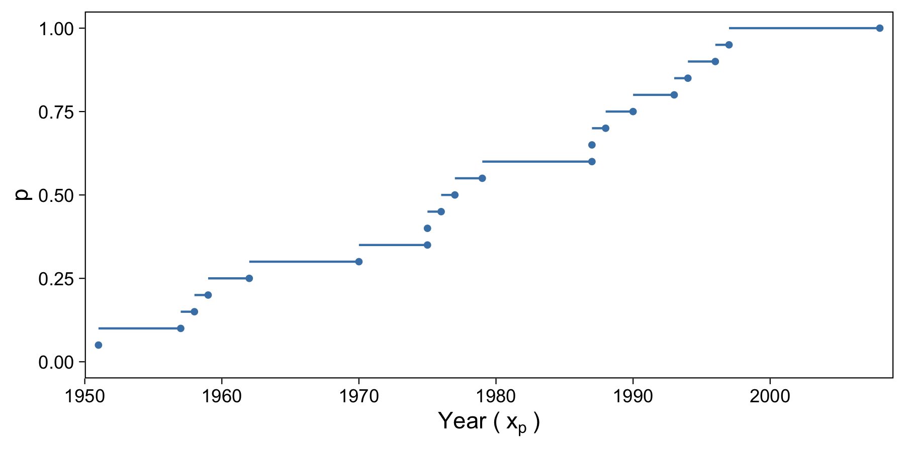
But with this method, computing quantiles relies on the step function nature of the data. Quantiles are just rounded up, which isn’t very accurate or “sophisticated”, and leads to jumps in quantiles. Let’s move onto a more useful estimator.
Linear Interpolation
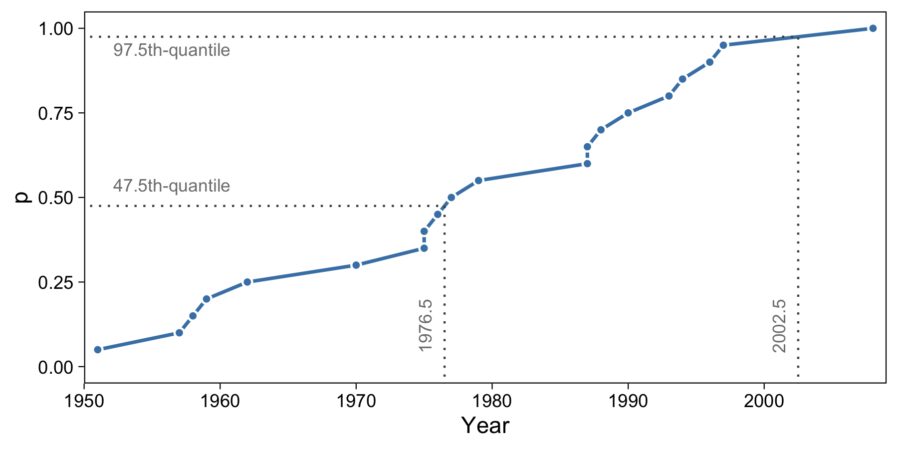
One of the next simplest quantile estimators for a sample of data is linear interpolation. Under this method, we draw a line between each point and compute \(x_p\) based on evaluating the line between two p-quantiles.
Let’s say we wanted to compute the 97.5th-quantile. We know the 95th-quantile is 1997 and the 100th-quantile is 2008. With the above method, the 97.5th-quantile would be 2008. But we can try to more accurately estimate the population by interpolating between the two years. Consider the following equation to interpolate:
The equation between 1997 and 2008 is like: \(x_p = 1997(1 - p)/(1 - 0.95) + 2008(p - 0.95)/(1 - 0.95)\), where \(p \in [0.95, 1.0]\). Thus, for the 97.5th-quantile, \(x_p = 2002.5\). Similarly, with the right values from the table above, \(Q(0.475) = x_p = 1976.5\) We can confirm this in R:
quantile(data$year, c(0.475, 0.975), type=4)
 47.5%  97.5%
1976.5 2002.5
We can visualize both of these calculations like so:
We can now flip the axes to illustrate the functional nature (i.e. inverting the function) of this interpolation method:
I find it very fascinating to see the lower end of the data start to make itself clear. What before we saw as the quantiles “starting” at 0.05, we now see as just the result of the quantiles evaluating to the same value (1951).
Mode-based Estimate
Another way to write the above linear interpolation equation is like the following:
where \(h = Np\). For example, for 20 data points and the quantile 0.55, we have \(x_p=1979\).
This formula has the benefit of being slightly more general, and is the form that five commonly used estimators use. One of these is the mode-based estimator. This is the default in R when we use the quantile function, so it’s very important we understand it.
The mode-based estimator has \(h = (N - 1)p + 1\). Thus, when \(p=0.55\) we have \(x_p = 1982.6\). We can confirm this with R:
quantile(data$year, 0.55) # type = 7
   55%
1982.6
It’s amazing how different this value is, a full three and a half years different from the linear interpolation method!
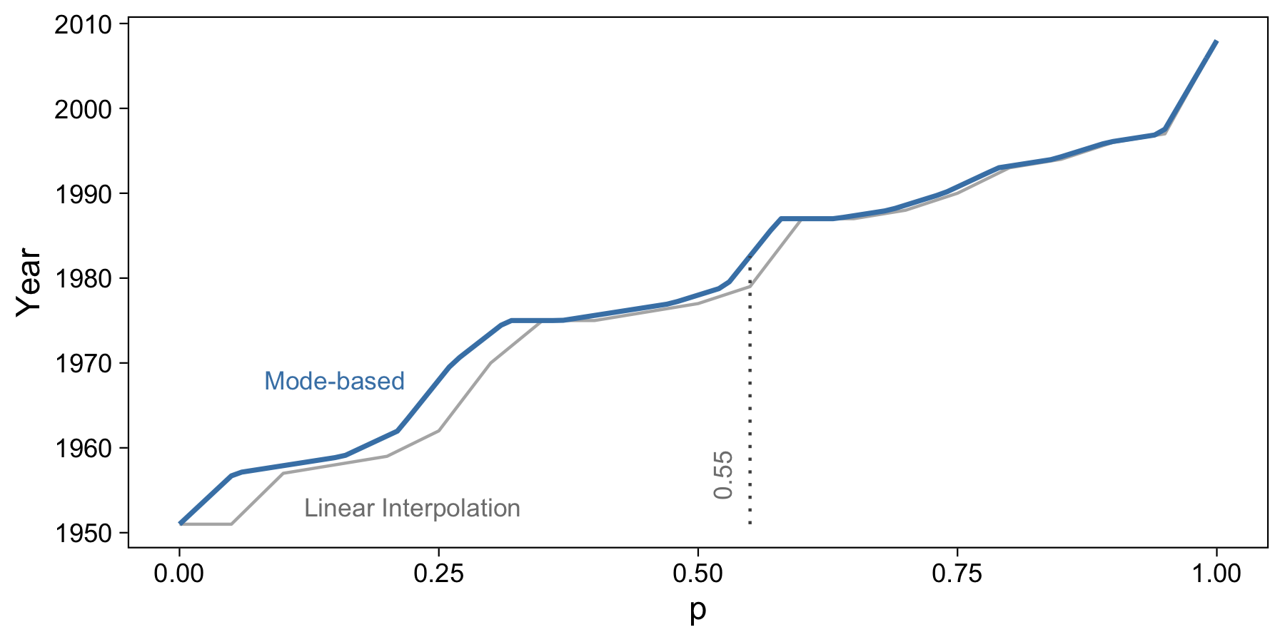
This estimation method takes care of the lower end of the data phenomenon that we ran into with linear interpolation. Mode-based estimation also appears somewhat smoother.
Hyndman and Fan (1996) outlined six characteristics that a sample quantile estimator should possess. The mode-based estimator satisfied five of six. Although it is distribution-free and generally a fine method to use, it is not unbiased. The best contender in my opinion is the median-based estimate (type 8 in R) since it would be approximately median unbiased.
Estimation Evaluation
Just for fun, we’ll compare how the quantile estimators evaluate when generalized to the remaining top 80 papers.
For example purposes, we’ll consider only papers published after 1940. Here are the linear interpolation sample quantiles for the top 20 papers (blue) and all top 100 papers (gray):
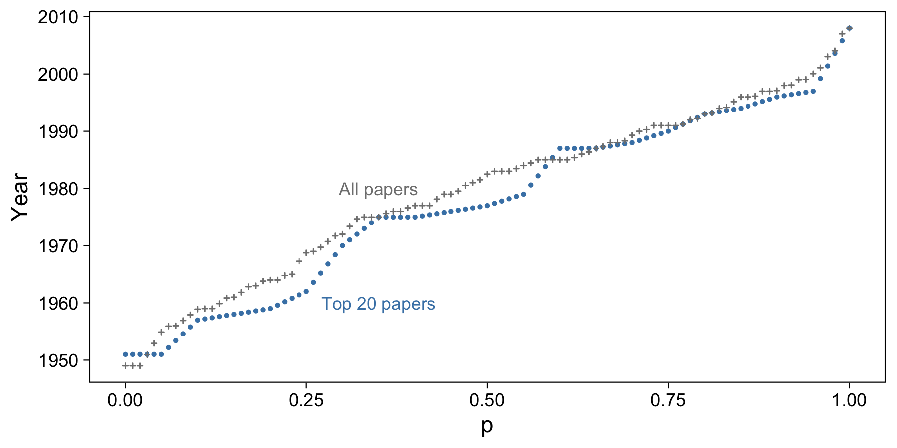
It looks like when we have more data, the quantile line is more linear, with fewer jumps. This is because we have more data to fill in some of those date gaps that showed up in the smaller sample. Remember that points here denote percentiles, not sample data.
It’s not incredibly useful in this situation, but we can also visualize a Q-Q plot to visualize the differences between the two sample distributions:
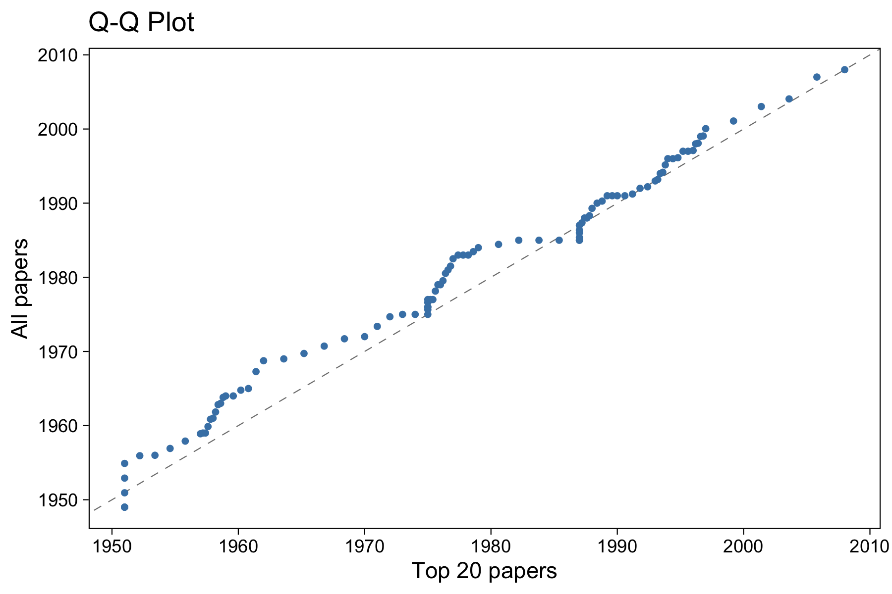
The dashed line is \(y=x\). Based on this image, we can tell that the two sample distributions are fairly similar, but not exactly the same. Each point represents a percentile (thus, 100 points shown). Areas of the graph where the points line up on the \(y=x\) line indicate points in the distributions that have the same proportion of data below them. For example, you can see that 1975 or so is one of these points: about the same amount of data is before 1975 in both distributions. Areas where the line is steeper than \(y=x\) indicate areas where the data in the vertical distribution is more dispersed than the horizontal. Likewise, those flat parts indicate the data is more dispersed in the horizontal distribution.
If we considered the top 100 papers as the theoretical population, we might choose not to use the top 20 papers to estimate quantiles of the population.
To round everything out, let’s calculate the sample median of the top 20 papers using a few different methods and compare that to our “population” median (from all 100 papers):
quantile(all_paper_years, 0.5, type = 1)
 50%
1983
This is our “population” median (I use type 1 because this is avoids any interpolation at all of the quantiles). Now, our sample median estimates:
types <- c(1,4,7,8)
quantiles <- sapply(types, function(t) quantile(top_20_paper_years, 0.5, type = t, names = F))
names(quantiles) <- types
quantiles
   1    4    7    8
1977 1977 1978 1978
As you can see, types 7 and 8 are closest to our “population” median by a full year. If we are concerned about an area with more dispersion in the sample data, for example at \(p=0.55\), then we actually see type 8 with an estimation error of only ten months. Type 7 has an error of 17 months, and types 4 and 1 have an error of five years! Clearly the latter are not particularly (and relatively) good (unbiased) estimators in this case.
Review
A few key takeaways from this article:
- A quantile is the value that corresponds to a specified proportion of the sample data or population.
- We usually rely on estimating quantiles with a sample estimator.
- The
quantilefunction in R provides nine different quantile sample estimator functions for the user to choose from. The default is mode-based estimation, which may not be the best estimator for your problem. - Consider a type 1 (inverse CDF) estimator if you want no interpolation of quantiles; type 4 (linear interpolation) if you want to be able to easily explain the mechanics of the interpolation; type 7 (mode-based estimation) if you want your results to match anyone who uses the default in R; and type 8 (median-based estimation) if you’d like to push for a more unbiased estimator.